
The FIFA World Cup is more than just a sporting event; it is a global phenomenon whose visual identity has mirrored the evolution of design, technology, and international culture for nearly a century. This chronological journey, from the first tournament in 1930 to the upcoming 2026 edition, reveals how the competition has transformed from a localized series of matches into a hyper-commercialized global brand.
The Era of Artistic Posters (1930–1950)
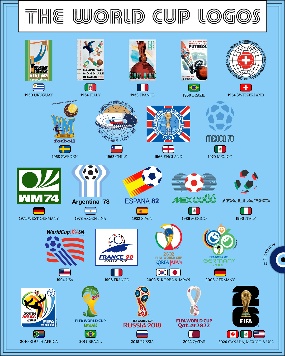
In the early decades, the tournament’s identity was defined by official promotional posters rather than standardized logos. These designs, such as the 1930 Uruguay poster by Guillermo Laborde, utilized Art Deco and early modernist styles, focusing on the athleticism of the human figure. This period is also marked by a significant twelve-year gap between 1938 and 1950, reflecting the cancellation of tournaments during the Second World War.
The Emergence of the Emblem (1954–1966)
The mid-1950s signaled a shift toward compact, recognizable emblems. The 1954 Switzerland logo is considered the first true World Cup "logo," moving away from human illustration toward national symbolism and sports iconography. A notable milestone occurred in 1966, where the logo prominently featured the Jules Rimet Trophy—the original prize that was later permanently awarded to Brazil in 1970.
The Telstar Revolution and Minimalist Geometry (1970–1998)
The 1970 Mexico World Cup introduced a paradigm shift driven by the advent of global color television. To ensure the ball remained visible on black-and-white screens, the Telstar ball was designed, and its geometric pattern became the core of World Cup branding for nearly thirty years. Logos throughout this era, such as Argentina '78 and Spain '82, utilized stark geometry and negative space to create scalable corporate marks that integrated host nations' flag colors.
From Abstract Trophies to Silhouette Standardization (2002–2022)
At the turn of the millennium, FIFA moved away from literal football motifs toward abstract representations of the modern trophy. The 2002 logo, celebrating the first co-hosted tournament in Asia, used a circular swoosh to symbolize unity. By 2014, FIFA began a period of strict standardization, where the logos for Brazil, Russia, and Qatar all adhered to the same silhouette of the FIFA World Cup Trophy, while using textures and colors to inject local cultural identity.
The 2026 Photographic Departure
The 2026 World Cup identity represents a radical departure from previous design philosophies. For the first time, the logo features a literal photograph of the trophy superimposed over a minimalist "26". This modular system is designed to be a blank canvas, allowing each of the 16 host cities across Canada, Mexico, and the United States to customize the brand with their own local colors and patterns.
Comments (0)
Join the Conversation
Login to share your thoughts with the community.
Login to Comment