
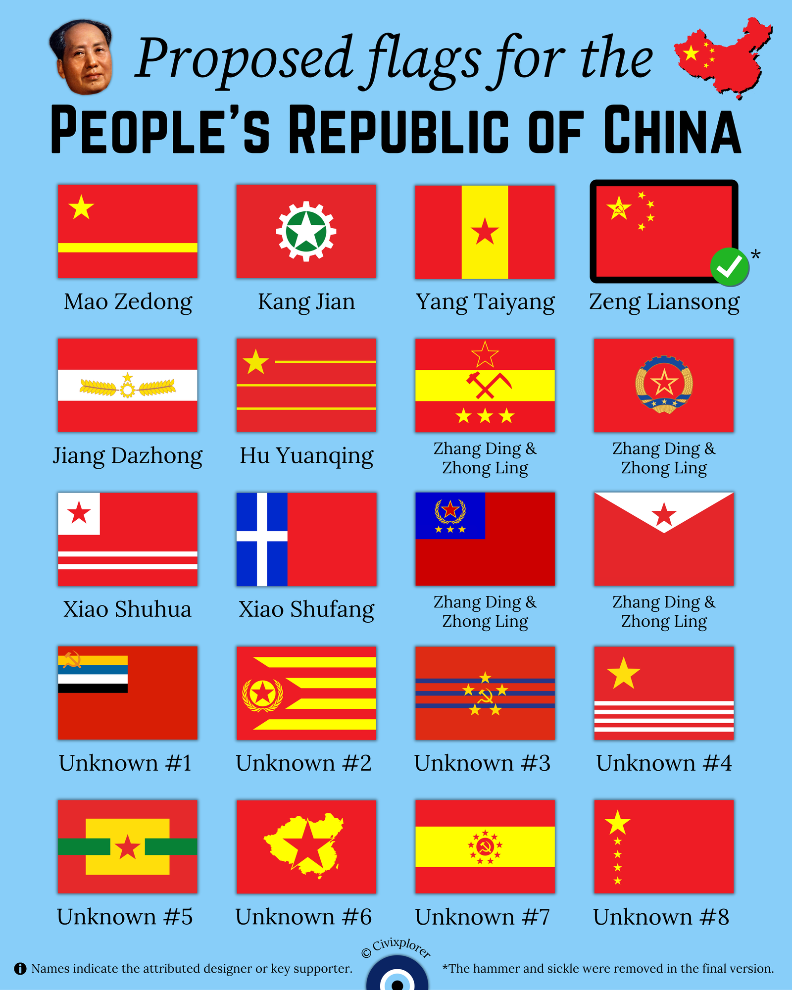
In July 1949, as the People’s Republic of China (PRC) prepared for its official founding, a nationwide contest was launched to design a new national symbol. This initiative resulted in nearly 3,000 submissions, representing a fascinating intersection of revolutionary ideology, traditional geography, and experimental vexillology. While we recognize the Five-star Red Flag today, the road to its adoption was filled with intense debate and dozens of striking alternatives.
The Winning Vision and the Hammer and Sickle
The design we know today was created by Zeng Liansong, an ordinary citizen from Shanghai. His original draft featured a large yellow star representing the Communist Party, surrounded by four smaller stars symbolizing the four social classes of China. However, a crucial detail was changed before the final adoption: Zeng’s original design included a red hammer and sickle inside the large star. The committee ultimately chose to remove this emblem to avoid making the flag appear too similar to the Soviet Union’s flag and to emphasize China’s unique path toward "New Democracy."
Mao Zedong’s "Yellow River" Preference
One of the most significant "what-ifs" in Chinese history involves the personal preference of Mao Zedong. Mao initially favored a design featuring a large yellow star and a thick horizontal yellow stripe on a red field. The stripe was intended to represent the Yellow River, the cradle of Chinese civilization. Despite Mao’s support, the design faced strong opposition from advisors like Zhang Zhizhong, who argued that the horizontal line appeared to "cut" the flag in half, symbolizing a divided nation rather than a unified one.
Accidental Flags: ¿Spanish and Catalan Connections?
Because the contest mandated red and yellow as primary colors, several designers accidentally recreated layouts that mirrored European flags. One proposal, categorized as "Unknown #2," features nine alternating yellow and red stripes with a red triangle at the hoist. To a modern observer, this design is a staggering coincidence as it perfectly mimics the red Estelada, the socialist Catalan independence flag, which wouldn't gain prominence until decades later. Similarly, several entries used horizontal tribands that, purely by chance, replicated the color proportions of the flag of Spain.
Geopolitical Literalism and Unusual Symbols
The finalists also included designs that attempted to map China literally. One rejected proposal featured a yellow map of China with a central star. Interestingly, the map was shaped like a "begonia leaf," reflecting the territorial claims of the era which included Outer Mongolia. Other entries leaned into industrial and agricultural motifs, utilizing gears, cogs, and wheat sheaves to represent the worker-peasant alliance. Some even broke the standard color palette, such as Xiao Shufang’s proposal, which included a blue vertical stripe and a white cross—a rare and anomalous geometric choice for a socialist state.
Why the Simple Design Won
The 1949 contest was a search for a symbol that could compress a complex political message into a clean, iconic form. The Five-star Red Flag eventually triumphed because of its graphic simplicity and inclusive symbolism. By moving away from literal geography or overly cluttered industrial icons, the final design provided a timeless representation of national unity.

Comments (0)
Join the Conversation
Login to share your thoughts with the community.
Login to Comment