
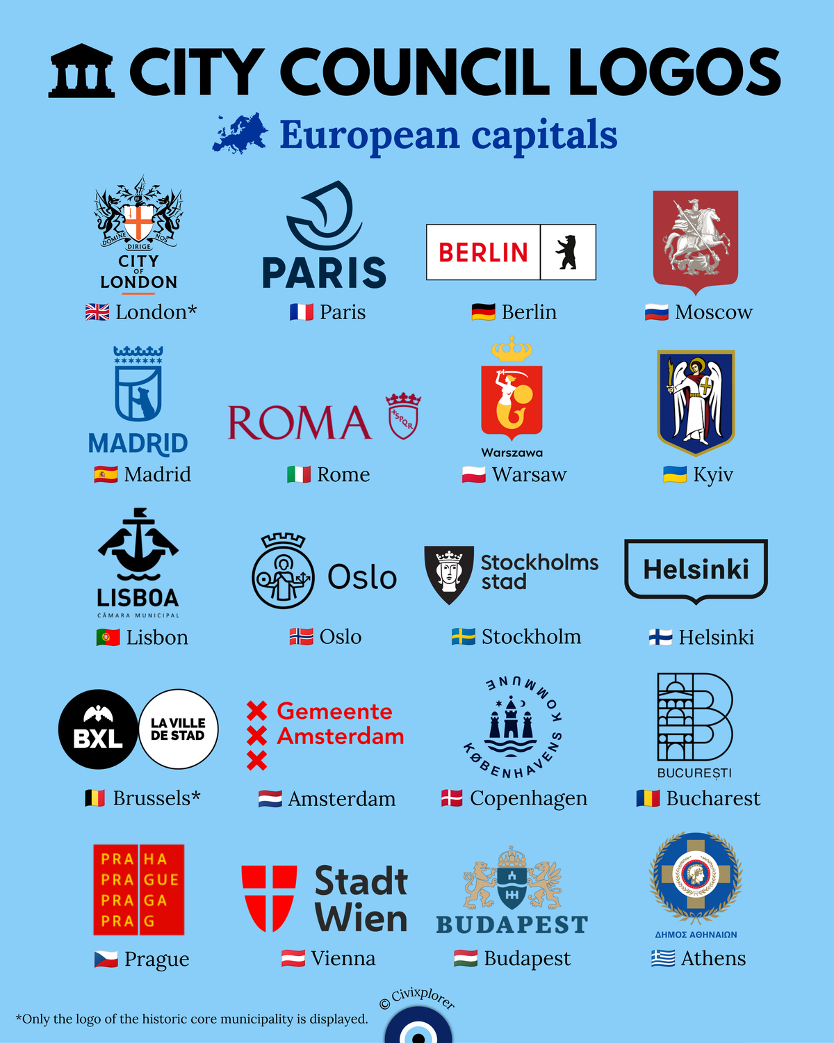
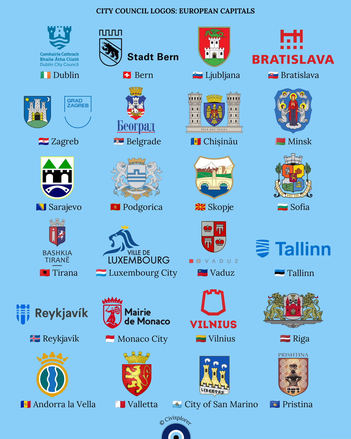
European capital cities visually express their authority, heritage, and administrative identity through forty-four distinct municipal logos and civic emblems. Across the continent, local governments navigate a striking design dichotomy between ancient heraldic traditions and contemporary corporate branding. While medieval coats of arms traditionally relied on intricate shields, patron saints, mythological guardians, and fortified stone castles to communicate historical continuity, modern administrative demands for digital legibility have led many municipalities toward sleek typography, abstract geometric symbols, and clean wordmarks designed for seamless cross-platform communication.
Several major Western European capitals have actively modernized their visual identities to ensure clarity across digital screens, public transport, and municipal services. Paris abstracts its historic symbol—the boat of the ancient river merchants known as the Nautae Parisiaci—into a single flowing line, subtle homage to the city's ancient Latin motto Fluctuat nec mergitur, meaning tossed by the waves but does not sink. Berlin utilizes a bold black silhouette of its iconic heraldic bear, a symbol deeply tied to the city since the thirteenth century, while Amsterdam features three prominent red Saint Andrew's crosses, a symbol documented on city flags since 1505. Other municipalities, such as Helsinki, Tallinn, and Bratislava, rely on sleek corporate wordmarks, with Bratislava maintaining a distinct red geometric identity for daily administration alongside its traditional silver three-towered castle shield.
In contrast, capitals across Central and Eastern Europe frequently retain rich religious, mythological, and historical figures as their civic guardians. Warsaw proudly displays the Syrenka, a crowned mermaid wielding a sword and shield rooted in local protective legend. Kyiv features the Archangel Michael carrying a flaming sword, a coat of arms formally reinstated by the city council in 1995 to re-establish historical continuity. Moscow preserves Saint George on horseback spearing a dragon, while Minsk features the Virgin Mary flanked by angels. Departing from traditional European heraldry altogether, Pristina adopts the Goddess on the Throne, a six-thousand-year-old terracotta Neolithic figurine discovered in 1956, anchoring its modern municipal brand in ancient regional history.
Municipal emblems also reflect complex demographic realities and unique administrative boundaries. Prague utilizes a clever multilingual grid that spells the city's name simultaneously across Czech, English, Spanish, Italian, and German, celebrating its status as a global crossroads. In bilingual environments, Brussels incorporates both French and Dutch into its brand layout, while Dublin layers its medieval Three Castles symbol with both Irish and English titles. Crucially, the logos for London and Brussels represent their historic core municipalities—the ancient City of London Corporation and the historic City of Brussels—rather than their entire metropolitan regions. From Belgrade's white fortress overlooking the confluence of the Sava and Danube rivers to Lisbon's maritime ship and ravens, these civic logos prove that modern urban branding remains deeply rooted in geography, legend, and history.

Comments (0)
Join the Conversation
Login to share your thoughts with the community.
Login to Comment